You might not have realized it, but your website’s navigation is the key to its success.
Good web navigation does a lot more than improve your website experience. It’s also how people find their way around and helps them perform tasks efficiently. With next-level site navigation, people can around your site more efficiently, search more effectively, and quickly get to what they’re looking for.
Whether you’re trying to build awareness of your brand or drive people through a conversion funnel, web navigation can play a big role in the success of your business.
With all of this in mind, you must always adhere to the most recent navigational best practices when creating the navigation structure for your website.
In this blog, we’ll introduce you to the fundamentals of website navigation, discuss its significance and influence, and show you how to structure your website the most effective.
What is the navigation of a website?
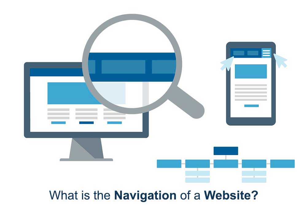
Website navigation is simply the process by which visitors can move from one page of your website to another.
They are given links in a variety of formats to follow until they locate the desired content, which accomplishes this.
However, once you begin creating your websites, you’ll realize that creating navigation that makes sense requires a fair amount of artistic skill.
It could be that you want to direct users to content you want them to interact with or that you want to make it as simple as possible for users to find a particular page. In either case, you must use the proper navigation to keep them on course.
Later on in this guide, we’ll give you some pointers to make sure your navigation is optimized and caution you against some of the most frequent navigational blunders.
Why is effective website navigation crucial?
Let’s examine the three main areas on your website where navigation is most crucial.
User experience:
- A user-friendly website navigation system makes it quick and simple for them to find and access the information they need on your website.
- Navigation should be at the forefront of your mind as you begin to consider your user experience. Make all pages accessible through browsing or searching, and make it simple to find popular pages.
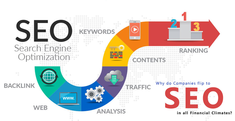
SEO (Search Engen Optimization):
- Your website’s navigation design is being examined by more than just human visitors. Bots, or tiny pieces of code, are sent by search engines to browse your website and evaluate your content.
- When you structure your website with search engines in mind, you make it simple for them to understand not only where to find all of your content, but also what’s behind each link.
- They can index your website and send you the right kind of traffic more easily as a result.
Conversion:
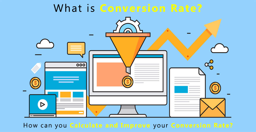
- Poor navigation can hurt your bottom line in addition to confusing visitors and bots. Your navigation structure should direct visitors to your converting pages if you want to encourage conversions.
- Websites that are conversion-focused direct visitors toward conversions, never letting them get lost or distracted.
Different forms of website navigation
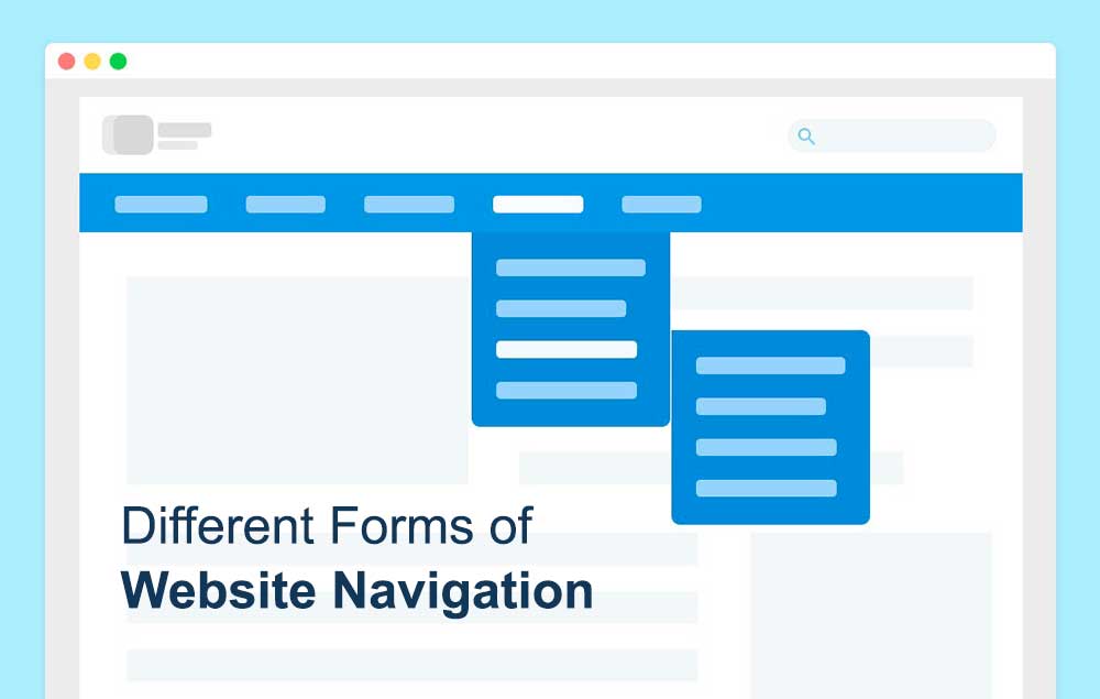
The majority of websites allow visitors to browse their pages in a variety of ways.
You can read some of the most typical navigation components on websites down below.
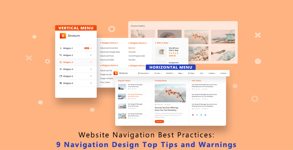
- The navigation bar:
- A drop-down menu:
- Footer:
- Sidebar:
- Breadcrumbs:
- internal ties (in-content):
9 best practices for effective website navigation
When we think about website navigation, a lot of people think of a mouse to click on a link to navigate around the website. However, that can be confusing and even cause users to lose their place in your content on the page. To guide your users smoothly through your pages, you should follow some basic best practices for effective website navigation design
1. Avoid creating something new.
While it’s true that good website design involves using creativity and attempting to provide website visitors with a memorable experience, there are many benefits to adhering to accepted standards when developing your web pages.
Visitors will anticipate this when they access your website on a smartphone if every other website uses a hamburger menu for mobile navigation.
You’re asking visitors to take an extra few milliseconds to figure out where to click if you include an arrow or some other unusual feature.
Always keep in mind that the purpose of web design is to make your website’s navigation as simple as possible for visitors to understand. Curveballs are a surefire way to drive away visitors and, as a result, drive away conversions.
2. Make navigational components distinct and clear.
It may seem like some of the most obvious advice you will ever hear about website navigation, but it’s still important to note: you should make sure that all of the navigation-related elements are easy to see.
A well-designed navigation menu is useless if all it does is keep visitors from seeing it. First and foremost, make an effort to prominently position menus, links, buttons, and other navigational elements on your pages.
Consider yourself to be a user. Consider where you would want to go on each page and where you would expect to find navigation options.
3. Create responsive menus
If you haven’t yet immersed yourself in responsive web design, you should because a large portion of your website’s visitors will be using mobile devices.
When a website is responsive, it can display each page and its contents in the right way on any size screen.
The hamburger menu strategy is one that many websites use to make their navigation menus more responsive. On a mobile device, using a drop-down hamburger menu as the primary navigation keeps the screen free of content.
Remember that responsive design isn’t just about user experience, even if your target audience uses desktop computers primarily. Your website’s mobile friendliness will also be taken into account when ranking you by the bots used by search engines to crawl your site.
4. Be dependable:
Using a consistent navigation design language throughout your website is just as important as ensuring that the navigation design on your website doesn’t deviate too much from that on other websites.
For instance, visitors will reasonably expect to see a hamburger menu in the top right corner of every page if you start with one there on your home page.
Or, if a link to your product pages is present in the page’s header navigation menu, don’t suddenly place it in the page’s footer.
User-friendly websites tend to have straightforward navigation. They give visitors instructions on how to navigate their pages as soon as they arrive and maintain this throughout their visit.
5. Be specific:
In keeping with the idea of avoiding surprises, you should also make it a point to make sure that each website navigation element you use expresses the content of the page your visitors are navigating clearly and understandably.
Any links on your website that users don’t know where they’re going to will probably raise suspicion in their minds. When they click any link, they should feel confident in their understanding of where they’ll land.
Making your navigation elements descriptive has another benefit for SEO: by making it simpler for search engines to index your website, visitors will have an easier time finding you.
If you’re not sure how to make the links and buttons on your website more descriptive, you might consider adding one of the following:
- The link’s target page’s title
- A list of the key points on the linked page
- A succinct explanation of what users can do on the linked page
6. Distinguish between calls to action and navigation
A call to action is a link that typically takes the form of a button or banner and urges users to act (usually to convert).
They stand out from other website navigational elements in that they guide visitors in a new direction rather than just making it simple for them to find the content they were already looking for.
They ought to be distinguished from other key navigation elements in this way.
For instance, your home page might have a primary navigation menu at the top, navigation links in the footer, and then several other links throughout its content.
However, you should use a call to action to guide visitors toward a particular page if you want them to do so.
To make them stand out, think about using banners or buttons in contrasting colors.
7. Reduce clicks:
Even though it’s nice to provide visitors with a variety of navigation options, you should work to reduce the amount of clicking required.
The idea of a website’s navigation being a pathway is helpful. The least amount of clicks necessary should separate your website visitors from the information or action they seek after they land there.
Links to well-liked or significant content should be included in your main navigation menus for this reason.
8. Remove Social Media Icons from the Navigation
Keep them in the footer and not the navigation unless you are actively trying to encourage clicks off to your social media as the main call-to-action. Otherwise, they will only serve to divert website visitors and obstruct the natural flow of traffic and the direction you want them to go on your site.
9. Display the contact details distinctly
A contact bar is a fantastic example of an easy-to-use feature while we are talking about them. This makes it possible for website visitors to contact you quickly and easily via phone, email, and any other channels you decide to provide. The navigation on your website should make this incredibly simple for them.
What are the warnings one should be aware of?
The navigation links together every component of your website, from the content to the URLs. Before building your website for the first time, you should be aware of the navigational errors listed here.
Avert lengthy lists:
On some websites, the homepage contains hundreds of pages and links. Not only is this navigation confusing for the audience, but it is also difficult to control.
The primary justification for limiting the links and pages in the primary navigation bar is search engines. Fewer pages in your navigation will help search engines identify your homepage as an authoritative page. The fact that more websites link to the homepage than to internal pages is the reason it will regard it as an authority. The entire website will then receive this authority.
Avoid Using Dropdown Menus:
You should avoid the dropdown for two reasons. As follows:
- Incompatible with search engines:
- To find content, search engines trawl through a website’s homepage. Dropdown menus can be challenging for the engine to navigate, though. The programming of popular search engines prevents them from crawling these menus. As a result, the search engine will not display your content in the search results, decreasing the traffic to your website.
- Visitors to Websites Find It Annoying:
- Dropdown menus annoy a lot of website visitors. It is annoying for users to have to quickly scan the available options while focusing their mouse on the tab. A user may also already be planning to click on a menu item when they drag the mouse pointer to it, but confusion results when additional options suddenly appear.
Stay away from the terms “services” and “solutions”:
Almost all businesses offer goods or services. As a result, tabs with such names don’t convey any new information. By preventing visitors from clicking on a tab that isn’t relevant, you can improve your website’s navigation and lower the bounce rate.
Because a user will never search for “products” or “services,” such labels also lower your rank. As an alternative, they will look for particular goods and services like “kids’ sunglasses” or “web development services.”
CONCLUSION
Every visitor to your website would ideally begin their visit on the homepage. However, this is not the case. Users wander the pages. It would be beneficial if you took precautions to keep website visitors from closing their browsers. Give them incentives to click on various links by making offers and arousing interest. You can achieve this by including appealing menu options that maintain a user-friendly interface on the website.
iMETADEX specializes in digital marketing services that help drive your online presence through search engine optimization (SEO) and search engine marketing (SEM).
To learn more about iMetaDex™, click here.
MetaSense Marketing Management Inc.
866-875-META (6382)
support@metasensemarketing.com

